Author:
- Giana
- June 4, 2017
Made with:
- HTML / CSS (SCSS)
About the code:
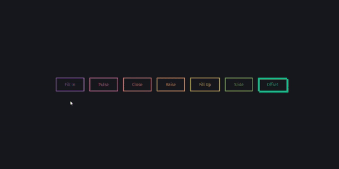
This is a nice and awesome collection of basic animations created with box-shadows. No extra elements or even pseudo elements required.
Tips: – Here all the blurs have been set to 0 since we want a solid fill; – Add the inset keyword so the box-shadow is on the inside of the element; – Animating the inset shadow on hover looks like the element is filling in from whatever side you specify ([top] and [left] accept negative values to become [bottom] and [right]); – Multiple shadows can be stacked; – If you’re animating multiple shadows, be sure to keep the same number of shadows so the animation is smooth. Otherwise, you’ll get something choppy.
Compatible browsers: Chrome, Edge, Firefox, Opera, Safari
Responsive: No
Dependencies: –
Download Demo and Code

