
Author:
- Richard Gonyeau
- February 25, 2016
Made with:
- HTML / CSS / JS
About the code:
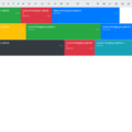
This is a nice and simple 8-Up image gallery. It uses the bootstrap grid framework to keep everything symmetrical, regardless of media query. Clicking on an image will initiate full width, and display a title and description. Classes have been included to move the description (top-right, bottom-left, etc.) so that the user can appropriately place it depending on the image content.
Compatible browsers: Chrome, Edge, Firefox, Opera, Safari
Responsive: Yes
Dependencies: jquery.js, jquery-ui.js
Bootstrap version: 3.3.5
Download Demo and Code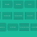